The Invisible Designer
The Invisible Designer.
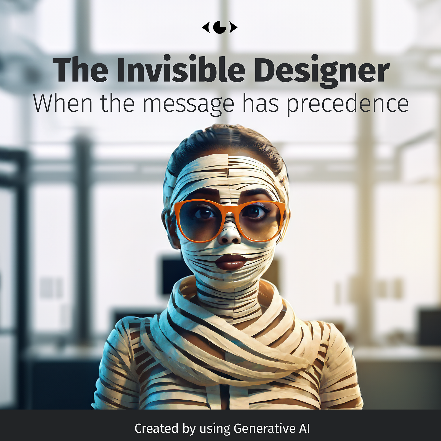
When the message has precedence.
In today’s digital age, graphic design has become a powerful message-delivery tool. It’s an art form that captivates audiences, evokes emotions, and influences decisions. However, I’ve observed a concerning trend lately — the overpowering of the message by the design itself.
Don’t get me wrong; standing out isn’t necessarily bad. Sometimes, the very essence of a design is to be bold, disruptive, and over-the-top. This “Hey, look at me!” approach can be practical when it aligns with the conveyed core message. But what happens when the bells and whistles overshadow the actual message?
In the design world, there’s a well-known principle: “Form follows function”. This means that the design elements should support the purpose or functionality of the object, not the other way around. Applied to graphic design, this principle suggests that visual assets should enhance the message, not overpower it.
Unfortunately, in an attempt to stand out and attract attention, many designs are becoming excessively elaborate, often at the expense of the message they’re supposed to convey. It’s like trying to read a book in a room full of distractions — you might appreciate the surroundings, but you’ll struggle to grasp the story.
The message can get lost in the background when design takes centre stage. While flashy graphics and unique typography may leave an impression, will anyone genuinely remember the core of what you’re trying to convey? Will they grasp your brand’s values, product benefits, or the cause you advocate for?
As designers, we need to remember to be humble. Our role is not to be the show’s star but the stagehands who set the scene for the message to shine. We should strive to create designs that visually engage and clearly and effectively communicate the intended message.
Ultimately, we should remember that graphic design is a form of communication. And like any good conversation, it should be clear, engaging, and free from unnecessary noise. So, let’s aim for designs that not only catch the eye but also capture the essence of the message. After all, isn’t that what good design is all about?