The Dead Horse Theory
I just discovered the Dead Horse Theory, and it’s brilliantly absurd.
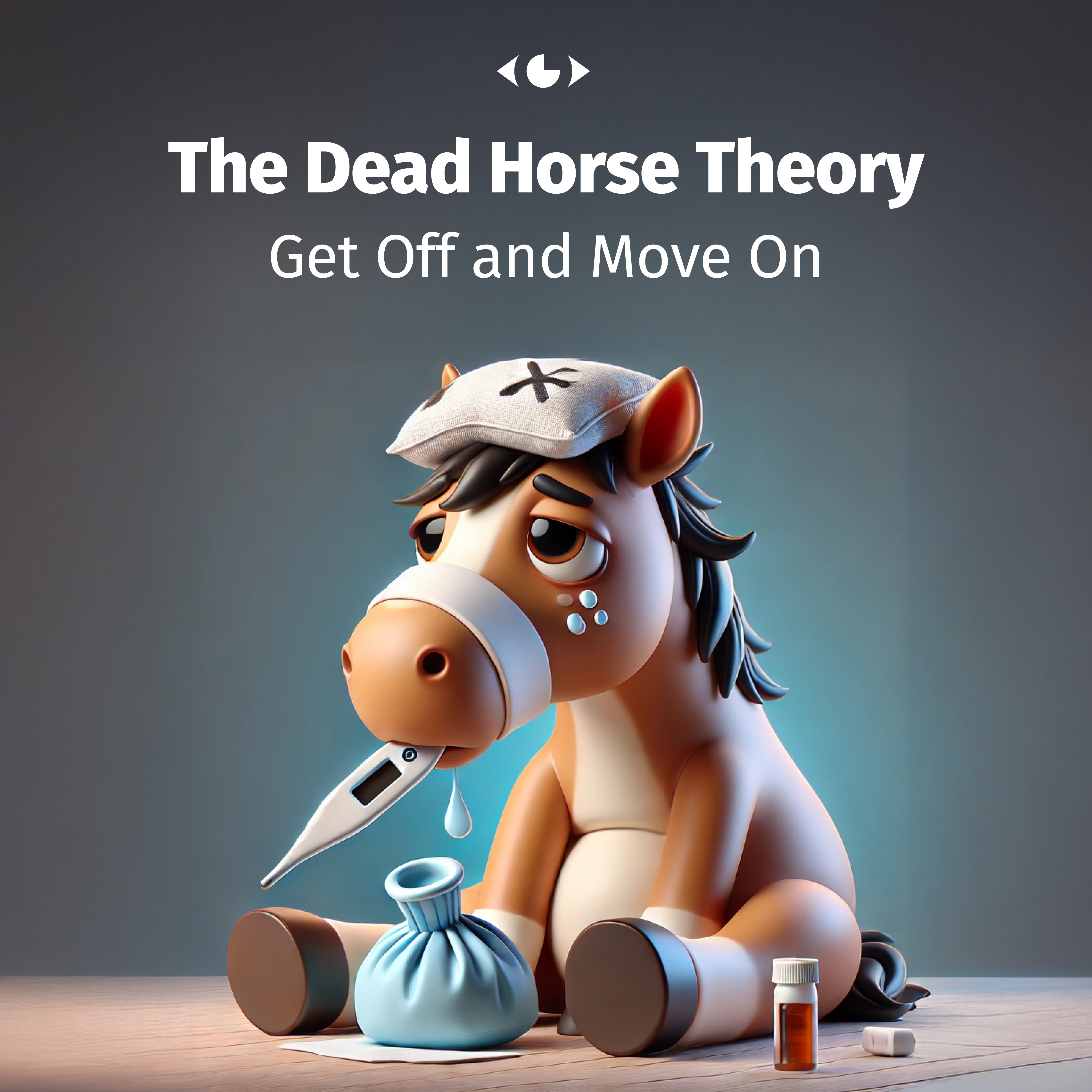
The idea is simple: when a horse is dead, there’s no point in trying to ride it. And yet, in graphic design, we often find ourselves beating the proverbial dead horse, desperately trying to make something work when, deep down, we know it’s a lost cause. It’s a mindset that can lead to frustration, wasted time and energy, and ultimately, subpar results.
As designers, we are constantly faced with challenges and obstacles. But sometimes, it’s important to recognize when it’s time to let go of an idea or approach that just isn’t working. This is where the Dead Horse Theory comes in – reminding us to be practical and realistic in our process.
It may seem counterintuitive for creatives to give up on something or admit defeat, but in reality, it takes courage and wisdom to do so. By acknowledging when a concept or design is not working, we can save ourselves from spinning our wheels and instead redirect our efforts towards finding a better solution.
However, recognizing a dead horse isn’t always easy. Often, we’re too close to the creative process, emotionally invested, or entrenched in habit to see clearly. This is precisely why collaboration in design is so valuable. Working as a team helps us spot these pitfalls early, preventing wasted effort and ensuring better creative outcomes.
Recognizing a Dead Horse in Graphic Design
So what does this look like in our industry?
It takes many forms, all equally painful to witness:
The Unkillable Legacy Logo
Envision a logo designed in the 80s that’s been through every effect in the Photoshop filter gallery. It has been beveled, embossed, drop-shadowed, and gradient-mapped to within an inch of its life, yet the client refuses to retire it. “It’s been with us since the beginning!” Sure—but so was dial-up internet, and we moved on.
The Overloaded Layout
A design that started with a clean concept but, after rounds of feedback, now includes a giant QR code, floating flags, stock photos with awkward cutouts, and a full paragraph of legal disclaimers in a 6-point font. The final attempt to “make it work” involves adding a stronger drop shadow—because obviously, that’s what’s missing.
The Typeface Tragedy
An identity where all headlines are in Papyrus (because it looks “elegant”), the body text is in Brush Script (because it’s “human”), and the call-to-action is somehow in Impact (because, well… impact). No amount of spacing or kerning can fix it. It’s a typographic catastrophe, yet we keep nudging letters around, changing font sizes, and hoping it will somehow work together.
The Impossible Client Request
“We need a poster that pops, but also looks classic, yet modern, while feeling minimalistic but also very detailed.” You do your best, but every revision adds more layers until the design resembles a visual Frankenstein. The client then asks, “Can you just tweak the color a bit?” No. No, we cannot. This horse is dead.
The Banner That Won’t Die
A web banner in Comic Sans that the client swears “performs well” (with no data to support that claim). Desperate to salvage it, the client asks to apply popular elements, such a Canadian flag clipart and a rainbow gradient. The result? Worse than before. We have just embalmed the dead horse instead of burying it.
Why Do We Keep Beating the Dead Horse?
There are several reasons why people in design—and in business in general—keep pushing doomed projects forward:
- The Sunk Cost Fallacy – “We’ve already spent so much time in this: we can’t start over now!” (Yes, we can.)
- Fear of Change – “People are familiar with this design; changing it would be risky!” (People were also familiar with floppy disks, but they adapted.)
- Client Attachment – “But I love this design from 1997!” (Unfortunately, nostalgia isn’t a viable design principle.)
- Hope Against Hope – “Maybe just one more tweak and it’ll work?” (It won’t.)
Knowing When to Walk Away
Great design isn’t just about aesthetics; it’s also about knowing when to stop. When a project ceases to be effective, when a visual identity no longer serves its purpose, or when the creative direction has been compromised beyond recognition, the best decision is often to start anew.
This clarity frequently comes from collaboration. Diverse perspectives help us recognize when to let go of a flawed idea, saving resources and ultimately leading to better outcomes.
So, the next time you find yourself adding yet another drop shadow, tweaking the 45th version of a failing concept, or attempting to convince a client that their outdated branding isn’t just vintage, remember this:
Get off the horse. Give it a proper funeral. And move on.
How Many Dead Horses Have You Seen?
Have you ever been stuck in a design project that just wouldn’t die? How did collaboration—or lack thereof—impact your decisions? Let’s share some design war stories.